Ayo!
The last two weeks, I worked with kdx to bring ya some hot and spicy new multiplayer game, "The yoyo of Zonk". It takes the core concepts of the pretty popular "Player vs Game" and try to put it in a zelda-like topdown dungeon.
Two weeks ago, we had no idea for a game. We started to work on an interesting mix between an horror survival sim and tower defense, where a human must survive as long as possible in a lost bunker. There were monsters lurking in the dark, breakable vital equipment to get scrap, GUNZ™, random layouts and a ton of fun ideas around the concept of breaking parts of the bunker to survive a little more.
But there were main issues.
First, we don't know how to make an horror game. It isn't a big issue by itself — It was even a good project to learn how to set a horrific mood. But, secondly, the project was way, way too much ambitious. We had a time window of two weeks, and every ideas would've not make their road to the final game. The light system already took one day, and I was too obsessed with... walls.
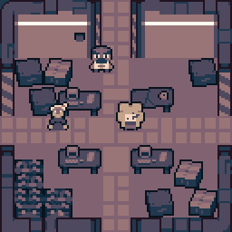
Fuck those walls.
We needed a new project, with lower ambition. Lower content. Higher polish.
I think two sources influenced kdx on the next idea :
At this project's stage, I was thinking we were going to create a Zelda 1 parody. This was mostly true, but sticking too much to it created some issues later, when I had to confront my view on the game to kdx's one.
So we played The Legend of Zelda. Both of us haven't made it to the first boss. Nice.
Eventually, we got a working room system and a way to spawn monsters. I decided to stick to the simple NES limitations. This includes :
We did not add flickering, palette swapping and tileset size limits – It would need too much effort for two weeks!
I love the limitation on the background tiles. At the start, I planned to do multiple levels – with different tilesets. So I chose the black color to make shadows (classic choice!). Since the black is a really strong "color", it is useful to show what blocks are important. Pixel artists tend to use black for outlines and important objects. In The Yoyo of Zonk, I used the black to show what blocks are solid/dangerous (except for the wall...). You can see it on these scrapped assets planned for the overworld.
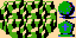
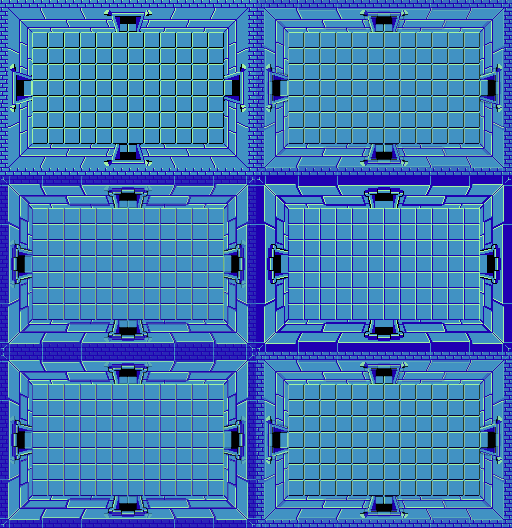
I also used ripped assets from spriters-resource.com as a base for my work. I wanted to give my assets a feeling of "same, but better". Look how I shamelessly copied the dungeon room look :
So. I was slowly working on the assets, when the main issue raised. What the gameplay will look like? We were unanimous on the activable traps for the player two (like in Player vs. Game). But for the player one... As I considered our game as a parody of Zelda 1, I thought the player should have a shitty sword. But kdx didn't like swords, so we had an argument. And then, he suggested the yoyo.
I was very skeptical at first. I sure love the yoyo from Terraria, but this can not translate very well as a 4-directions attack! I was wrong. The yoyo feels strange, sure – the closer we are to the enemy, the faster the yoyo will bounce back and restart an attack, and the faster the enemy will die. But it actually turned to be more fun than I thought! The player can go close to the monsters and kill them faster, but with a higher chance of getting hit (especially with the randomly moving enemies), or he can stay away and try to hit right.
One night, we also designed the curses of the Mind (player two gaaaameplay, baby!). In the final game, we have :
Every curses can be used with others, to achieve tense situations. For example, the control scheme inversion can be used with fireballs or shurikens, since the player one's reaction will be to flee. A screen inversion during a control scheme inversion can confuse even more. Spikes can trap the player, making it easy to throw a projectile.
The "HI I'M DAISY" curse is the equivalent of Mario Kart 8 Deluxe's coin: an item that limits the overall power.
We had other curses, like lazer shooting, pause, screen freezing, ugly shaders, more monsters to spawn, item despawn and pop-ups, but there were cut due to time management or balancing. I did some unused sprites, enjoy!

Kdx designed the flies, double flies and the final boss, while I designed the skeleton, the roomba and the fairy-bee.
Kdx's flies are obvious references to The Binding of Isaac, and run in the player. At first, they were stacking, resulting in a simple fly that dropped other flies when hit. Erk. He patched them eventually so they didn't stack, and they were SO MUCH better! Now they act like a big swarm and they're even more funny to kill. I agree that they're the best enemies in the game, perfectly balanced (as all things should be).
The double flies are very tanky in my opinion. They act as a buff for flies in medium and high difficulty, having increased chance to replace them.
The skeletons are like in The Binding of Isaac too. They move from tile to tile, and shoot bones (only in four directions oh god thanks). Their random movements make them very hard to hit, so we added a small pause when they're firing. I still think they're too fast and have too much life, but kdx's fine with them.
The fairy-bee was at first a fairy acting as a troll, but kdx's joked about the similarities between their sprite and wasps. So we decided to make it a bee instead. They move randomly, but tend to return to the center if they go too far.
The roomba is the funniest and the shittiest enemy in the game. You shoot them, and they goes brr brr.
At last, but not least, the Lamp. It is the final boss – it has even shitty lore around to justify why! It is also a big reference to Mother 1/Earthbound Zero. It has its own room, with its own music and its own movements... Well, he only flies around the room , shooting randomly fireballs, shurikens and Sakurai/Miyamoto heads, but hey, it's only a lamp. His life and velocity increases with the difficulty

Kdx wanted to add a lot of jokes and memes, to mock the zelda genre and troll the players. At first, I wanted them to be only in some dungeons, to keep the first and the second levels "clean" (the first was supposed to be the overworld). But we ran out of time, and were forced to mix everything in the same level. We switched from manually designed dungeons to randomly generated levels, and added a bunch of stupid jokes next to original Zelda content.
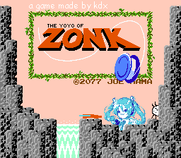
We added memes and private jokes everywhere. The title screen already includes Hatsune Miku, the imposter from Among Us, kdx's potato man, a Joe Mama joke and Comic sans. Barely every SFX are references, from Marth's shout when Zonk falls, to SFII's punch and Octopath Traveler's victory fanfare.
It makes an enjoyable potpourri of gen Z jokes, and add a layer of absurdity to the already silly "The Yoyo of Zonk". Look at this title. If it isn't a shitpost, I don't know what it is.
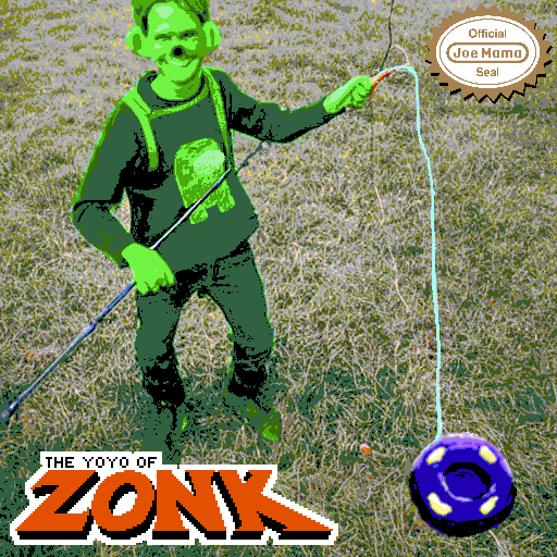
This promotional image looks so silly. It was generated on a AI image generator (https://stablediffusionweb.com/), and heavily modified by hand.
I also tried to put a lot of effort into the soundtrack. We only have three tracks, but it wanted to include some funny and easily recognizable motifs in the music. But I'm not a musician, and I lost a lot of time trying to make something listenable with lmms. The instruments are badly mixed and the track feels messy, but I was proud to blend Megalovania and a vine boom my remix of Zelda's dungeon theme.
The Legend of Zelda's instruction booklet
The Yoyo of Zonk's instruction booklet
The manual is also itself a masterpiece. We've put a lot of efforts in it, trying to reproduce Zelda's original manual, while adding jokes and a big shitty lore. You can compare the two!
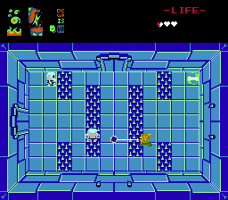
I think I've covered the important aspects of the game. Overall, I had a lot of fun making this game in kdx's apartment, even if we had some arguments and daily difficulties (especially with our different sleep schedules). I'm more proud of this game than my previous ones (even with the high level of shitposting)... and it's a good sign, I guess?
Thanks you for reading, and keep Zonkin' hard!
– Marina
Check the game on itch.io!
Listen to the wonderful, amazing, extraordinary soundtrack on Bandcamp!
Read the release announcement on kdx's blog!
-- Note to myself – seek the typos tomorrow. Now sleep you bastard.